| Full article title | DataCare: Big data analytics solution for intelligent healthcare management |
|---|---|
| Journal | International Journal of Interactive Multimedia and Artificial Intelligence |
| Author(s) | Baldominos, Alejandro; de Rada, Fernando; Saez, Yago |
| Author affiliation(s) | Universidad Carlos III de Madrid, Camilo José Cela University |
| Primary contact | Email: abaldomi at inf dot uc3m dot es |
| Year published | 2018 |
| Volume and issue | 4(7) |
| Page(s) | 13–20 |
| DOI | 10.9781/ijimai.2017.03.002 |
| ISSN | 1989-1660 |
| Distribution license | Creative Commons Attribution 3.0 Unported |
| Website | http://www.ijimai.org/journal/node/1621 |
| Download | http://www.ijimai.org/journal/sites/default/files/files/2017/03/ijimai_4_7_2_pdf_16566.pdf(PDF) |
Abstract
This paper presents DataCare, a solution for intelligent healthcare management. This product is able not only to retrieve and aggregate data from different key performance indicators in healthcare centers, but also to estimate future values for these key performance indicators and, as a result, fire early alerts when undesirable values are about to occur or provide recommendations to improve the quality of service. DataCare’s core processes are built over a free and open-source cross-platform document-oriented database (MongoDB), and Apache Spark, an open-source cluster computing framework. This architecture ensures high scalability capable of processing very high data volumes coming at rapid speeds from a large set of sources. This article describes the architecture designed for this project and the results obtained after conducting a pilot in a healthcare center. Useful conclusions have been drawn regarding how key performance indicators change based on different situations, and how they affect patients’ satisfaction.
Keywords: Architecture, artificial intelligence, big data, healthcare, management
Introduction
When managing a healthcare center, there are many key performance indicators (KPIs) that can be measured, such as the number of events, the waiting time, the number of planned tours, etc. Often, keeping these KPIs within the expected limits is vital to achieving high user satisfaction.
In this paper we present DataCare, a solution for intelligent healthcare management. DataCare provides a complete architecture to retrieve data from sensors installed in the healthcare center, process and analyze it, and finally obtain relevant information, which is displayed in a user-friendly dashboard.
The advantages of DataCare are twofold: first, it is intelligent. Besides retrieving and aggregating data, the system is able to predict future behavior based on past events. This means that the system can fire early alerts when a KPI is expected to have a future value that falls outside the expected boundaries, and it can provide recommendations for improving the behavior and the metrics, or prevent future problems with attending events.
Second, the core system module is built on top of a big data platform. Processing and analysis are run over Apache Spark, and data are stored in MongoDB, thus enabling a highly scalable system that can process large volumes of data coming in at very high speeds.
This article will discuss many aspects of DataCare. The next section will present context for this research by analyzing the state of the art and related work. After that an overview of DataCare’s architecture will be presented, including the three main modules responsible for retrieving data, processing and analyzing it, and displaying the resulting valuable information.
After the architecture has been explained, the subsequent three sections will describe the preprocessing, processing, and analytics engines in further detail. The design of these systems is crucial to providing a scalable solution with an intelligent behavior. After discussing those engines in detail, the article will then describe the visual analytics engine and the different dashboards that are presented to users.
Finally, the penultimate section will describe how the solution has been validated, and the last section will provide some conclusive remarks, along with potential future work.
State of the art
Because healthcare services are very complex and life-critical, many works have tackled the design of healthcare management systems, aimed at monitoring metrics in order to detect undesirable behaviors that decrease their satisfaction or even threaten their safety.
Discussion on the design and implementation of the healthcare management system is not new. In the 2000s, Curtright et al.[1] described a system to monitor KPIs, summarizing them in a dashboard report, with a real-world application in the Mayo Clinic. Also, Griffith and King[2] proposed to establish a “championship” where those healthcare systems with consistently good metrics would help improve decision making processes.
Some of these works explore the sensing technology that enable proposals. For instance, Ngai et al.[3] focus on how RFID technology can be applied for building a healthcare management system, yet it is only implemented in a quasi real-world setting. Ting et al.[4] also focus on the application of RFID technology to such a project, from the perspective of its preparation, implementation, and maintenance.
Some previous works have also tackled the design of intelligent healthcare management systems. Recently Jalalet al.[5] have proposed an intelligent, depth video-based human activity recognition system to track elderly patients that could be used as part of a healthcare management and monitoring system. However, the paper does not explore this integration. Also, Ghamdi et al.[6] have proposed an ontology-based system for prediction of patients’ readmission within 30 days so that those readmissions can be prevented.
Regarding the impact of data in a healthcare management system, the importance of data-driven approaches has been addressed by Bossen et al..[7] Roberts et al.[8] have explored how to design healthcare management systems using a design thinking framework. Basole et al.[9] propose a web-based game using organizational simulation for healthcare management. Zeng et al.[10] have proposed an enhanced VIKOR method that can be used as a decision support tool in healthcare management contexts. A relevant work from Mohapatra[11] explores how a hospital information system is used for healthcare management, improving the KPIs; and a pilot has been conducted in Kalinga hospital (India), turning out to be beneficial for all stakeholders.
Some works have also explored how to increase patients’ satisfaction. For example, Fortenberry and McGoldrick[12] suggest improving the patient experience via internal marketing efforts, while Minniti et al.[13]propose a model in which patient feedback is processed in real time, driving rapid cycle improvement.
To place this work into its context, what we have developed is a data-driven intelligent healthcare management system. Because of the volume and velocity of big data, we have used a big data architecture based on the one proposed by Baldominos et al.[14], but updating the tools to use Apache Spark for the sake of efficiency. Also, a pilot has been conducted to evaluate the performance of the proposed system.
Overview of the architecture
DataCare’s architecture comprises three main modules: the first oversees retrieving and aggregating the information generated in the health center or hospital, the second processes and analyzes the data, and the third displays the valuable information in a dashboard, allowing the integration with external information systems.
Figure 1 depicts a broad overview of this architecture, while the following describes each of the modules in further detail.

Figure 1. DataCare’s architecture. The first column lists the data sources, which are retrieved and aggregated by AdvantCare software (second column). The last column shows the big data platform, which contains engines for the data processing and analytics module (yellow) and the data visualization module (purple).
Data retrieval and aggregation module
Data retrieval is carried out by AdvantCare software, developed by Itas Solutions S.L. AdvantCare is a set of hardware and software tools designed to manage communications between patients and healthcare staff. Its core comprises three main systems: 1) Buslogic manages and aggregates the information of actions carried out by nondoctor personnel (nurses and nursing assistants), 2) AdvantControl monitors and controls the infrastructure, and 3) EasyConf manages voice communication.
In hospital rooms, different data acquisition systems are placed, which often consist of hardware devices connected to an IP network and include one of the following elements:
- sensors such as thermometers or noise or light sensors measuring some current value or status either in a continuous or periodic fashion and sending it to Buslogic or AdvantControl servers;
- assistance devices such as buttons or pull handlers that are actioned by the patients and transmit the assistance call to the Buslogic server;
- voice and video communication systems that send and receive information from other devices or from Jitsi (SIP Communicator), which are handled by EasyConf; or
- data acquisition systems operated by means of graphical user interfaces in devices such as tablets, e.g., surveys or other information systems.
In general terms, the information retrieved by AdvantCare belongs to one of the following:
- Planned tours: Healthcare personnel will periodically visit certain rooms or patients as a part of a pre-established plan. Data about how shifts are carried out is essential to evaluate assistance quality and the efficiency of nurses and nursing assistants.
- Assistance tasks: Nurses and nursing assistants must perform certain tasks as a response to an assistance call. It would be great to know in advance these tasks, so they can be monitored properly.
- Patient satisfaction: The most important service quality subjective metric is the patient's satisfaction, which is obtained by mean of surveys.
As said before, AdvantCare software comprises three systems, as well as communication/integration interfaces.
Buslogic
This software oversees communication with the assistance call systems. It also handles GestCare and MediaCare, which are the systems used for tasks planning, personnel work schedules, patient information, satisfaction surveys, and entertainment. Buslogic retrieves core business information about the assistance process, including alerts, waiting times to assist patients, and achieved assistance objectives.
AdvantControl
This software controls and monitors the infrastructure and automation functionalities, including the status of lights, doors, or the DataCare infrastructure itself. It provides real-time alerts about possible quality of service issues.
EasyConf
This software manages SIP Communicator and provides data about calls such as the origin, the destination, and the total call duration.
Communication/Integration APIs
Data can be retrieved from AdvantCare servers by means of SOAP web services, which get used in those requests that require high processing capacity, and are stateless. Also, the information can be accessed via a RESTapplication programming interface (API), where the calls are performed through HTTP requests, and data is exchanged in JSON-serialized format. REST servers are placed in the software servers themselves (either Buslogic, AdvantControl or EasyConf), thus allowing real-time queries, as well as parameter modifications. Finally, a TELNET channel will allow asynchronous communication to broadcast events from the servers to the connected clients.
Data processing and analysis module
The Data Processing and Analysis module is part of a big data platform based on Apache Spark[15], which allows an integrated environment for the development and exploitation of real time massive data analysis, outperforming other solutions such as Hadoop MapReduce or Storm, scaling out up to 10,000 nodes, providing fault tolerance[16]and allowing queries using a SQL-like language.
As shown in Figure 1, this module comprises four different systems: Preprocessing Engine, Processing Engine, Big Data and Historic Data Warehouses, and Analytics Engine.
Preprocessing Engine
This system performs the ETL (extract-transform-load) processes for the AdvantCare data. It first communicates with AdvantCare using the available APIs to retrieve the data, which later is transformed into a suitable format to be introduced to the Processing Engine. Because of the metadata provided by AdvantCare, the information can be classified to ease its analysis. Normalized and consolidated data gets stored in MongoDB, the leading free and open-source document-oriented database, where collections store both data for real time analysis as well as historic data to support batch analysis to compute the evolution of different metrics in time.
Processing Engine
This system runs over the Spark computing cluster and oversees data consolidation processes for periodically aggregating data, also supporting the alert and recommendation subsystems.
Data Warehouses
Data filtered by the Preprocessing Engine and enriched by the Processing Engine gets stored in the Big Data Warehouse, responsible for storing real-time information. Additionally, the Historic Data Warehouse stores aggregated historic data, which gets used by the Analytics Engine to identify new trends or trend shifts for the different quality metrics.
Analytics Engine
This system runs the batch processes that will apply the statistical analysis methods, as well as machine learning algorithms over real-time big data. Along with the historic data, time series and ARIMA (autoregressive integrated moving average) techniques provide diagnosis of the temporal behavior of the model. This engine also implements a Bayes-based early alerts system (EAS) able to detect and predict a decrease in the service quality or efficiency metrics under a preset threshold, sending alerts in the form of push or email notifications.
Data visualization module
This module provides a reporting dashboard that receives information from the big data platform in real time and displays two panels. The first panel shows the main quality and efficiency metrics in real time, along with its evolution over time and the quality thresholds. The second panel provides the diagnoses computed by the Analytics Engine, as well as intelligent recommendations to prevent reaching undesired situations, such as metrics falling below acceptable thresholds.
The dashboard is implemented using the D3.js library, providing nice and intuitive visualizations.
Preprocessing Engine
The Preprocessing Engine performs the ETL process over the data, and this section describes how different data are extracted from the various sources, transformed and loaded as a part of this process.
Extraction
This engine extracts the assistance call data by polling the AdvantCare module every five minutes, retrieving all data generated by all the rooms. Data from planned tours are retrieved daily also by polling the REST API, while patients’ satisfaction surveys are loaded as CSV files.
Transformation
The Preprocessing Engine performs several transformation tasks so that data is in a suitable format to be handled by the Processing Engine and the Analytics Engine.
Assistance task events
Assistance task events get transformed into MongoDB documents, where each event is stored in a different document, and all of them belong to the events collection. When one event status changes (e.g., from “activated” to “notified”), the document is updated to reflect these changes.
Figure 2 shows a sample document representing an event.
{ “_id”: ObjectId(“565c234f152aee26874d7a18”), “full_event”: true, “presence”: { “ev”: “EV PRES”, “ts”: ISODate(“2015-10-02T01:35:36.384Z”) }, “area”: “Madrid”, “notification” : { “ev”: “EV NOTIF”, “ts”: ISODate(“2015-10-02T01:32:21.984Z”) }, “room_number”: “126”, “location”: “PERA”, “activation” : { “week”: 40, “weekday”: 5, “user”: “Anonimo”, “hour”: 1, “minute”: 31, “year”: 2015, “month”: 10, “day”: 2, “ev”: “EV PERA”, “ts”: ISODate(“2015-10-02T01:31:45.696Z”) }, “room_letter”: “-”, “center”: “Aravaca”, “day_properties”: { “holiday_or_sunday”: true, “social_events”: true, “rain”: true, “extreme_heat”: true, “summer_vacation”: true, “holiday”: true, “weekend”: true, “friday_or_eve”: true }, “floor”: “1”, “times”: { “cancellation_notification”: 195, “used”: 194, “idle”: 36, “cancellation_activation”: 231, “total”: 230, “cancellation_presence”: 1 }, “hour_properties”: { “shift_change”: true, “shift”: “TARDE”, “sleeptime”: true, “nurse_count”: “8”, “dinnertime”: true, “lunchtime”: true }, “cancellation”: { “ev”: “EV CPRES”, “remote”: true, “ts”: ISODate(“2015-10-02T01:35:37.248Z”) } }
|
Planned tours
Data from planned tours are retrieved daily from AdvantCare using the REST API and are transformed to a MongoDB document in the shifts collection. A sample document is shown in Figure 3.
{ “_id”: ObjectId(“569e50b1aa40450a027eb4ec”), “floor”: 3, “room”: 326, “date”: “1/10/15”, “hour”: “9:00:45”, “center_name”: “Aravaca”, “ts”: ISODate(“2015-10-01T09:00:45.000Z”), “shift_type”: “MAÑANA” }
|
Satisfaction surveys
As stated before, satisfaction data are loaded as CSV files. The Preprocessing Engine transforms it into a MongoDB document, which gets stored into the surveys collection. Figure 4 shows the structure of a sample document representing a satisfaction survey.
“_id” : ObjectId(“569e483daa404509a9796754”), “care_punctuation”: 2, “center”: “Aravaca”, “area”: “Madrid”, “floor”: 2, “night_punctuation”: 5, “morning_punctuation”: 4, “speed_punctuation”: 2, “price_quality_punctuation”: 2, “afternoon_punctuation”: 4, “year”: 2015, “month”: 11, “day”: 27, “date”: ISODate(“2015-11-27T00:00:00.000Z”), “global_punctuation”: 2, “id”: “Anonimo”, “room”: 221 }
|
Load
Once data is transformed into MongoDB documents (BSON format), they are loaded into the corresponding MongoDB collection.
Processing Engine
The Processing Engine runs batch processes to consolidate data previously transformed by the Preprocessing Engine. This consolidation aggregates data to be handled by the Analytics Engine.
Periodic data consolidation
As the Processing Engine consolidates data periodically, two new collections are created, namely hourly anddaily, depending on the periodicity of the aggregated data. A sample document in the hourly collection is shown in Figure 5.
{ “_id”: ObjectId(“5665a51f0b1d4cf6f9728ae4”), “center”: “Aravaca”, “date”: { “week”: 40, “weekday”: 4, “hour”: 4, “ts”: ISODate(“2015-10-01T04:00:00.000Z”), “year”: 2015, “month”: 10, “day”: 1 }, “idle_time”: 67, “wait_time”: { “floors”: { “1”: 0.6363636363636364, “2”: 29.5, “3”: 120, “4”: 0.5 }, “shifts”: { “NOCHE”: 23.72222222222222 }, “total”: 427, “types”: { “EV HABA”: 4, “EV PERA”: 359 } }, “used_time”: 344, “activity”: { “floors”: { “1”: 11, “2”: 2, “3”: 3, “4”: 2 }, “shifts”: { “NOCHE”: 18 }, “total”: 18, “types”: { “EV HABA”: 17, “EV PERA”: 1 } } }
|
This aggregation enables fast visualization of aggregated data, and it is key for the Analytics Engine to detect strange behaviors, fire alerts, or make recommendations. Both the hourly and daily collections are indexed by timestamp to enable fast filtering on consolidated data based on temporal queries.
Real-time data processing
To support the real-time dashboard, a process takes the data from the hourly collection and computes the average value for each KPI for different time periods: last day, last week, last month, and since the beginning. This allows comparison of the current value for a KPI with the average of past periods of time. A small fragment of a sample document in the realtime collection showing the aggregated data for the “activity” (number of events) KPI is shown in Figure 6.
{ “_id” : ObjectId(“56850cb00b1d4cf6f9b4f2da”), “center”: “Aravaca”, “activity”: { “total”: [ {“type”: “yesterday”, “hour”: 0, “value”: 106}, {“type”: “lastweek”, “hour”: 0, “value”: 58}, {“type”: “lastmonth”, “hour”: 0, “value”: 52}, {“type”: “alltime”, “hour”: 0, “value”: 51.1489}, {“type”: “yesterday”, “hour”: 1, “value”: 20}, {“type”: “lastweek”, “hour”: 1, “value”: 33.571}, ... }
|
Analytics Engine
The Analytics Engine is responsible for performing an intelligent analysis of the data to compute daily prediction, firing alerts when an undesired condition is detected (e.g., a certain metric falls under a specified threshold) and suggesting recommendations. This section describes these processes.
Prediction system
The prediction system takes the data contained in the events collection along with contextual data (weather, holidays, or labor dates, etc.) and predicts the estimated value for each KPI for every hour in the next day. This batch process is executed daily. The predicted values are stored in a document per each KPI, in the predictionscollection in MongoDB. A sample document is shown in Figure 7.
{ “_id”: ObjectId(“5683f978e4b0d671e427e1db”), “center”: “Aravaca”, “name”: “wait_time.total”, “date”: “1/10/15”, “predictions”: { “0”: 5637, “1”: 28557, “2”: 15711, “3”: 4133, ... }
|
The prediction algorithm analyzes behavioral patterns in the events data and applies these patterns to simulate future behavior. The algorithm proceeds as follows for each KPI:
Given N clusters, the algorithm computes a matrix M where each row is a cluster and each column is an hour, thus resulting in an Nx24 matrix. The value in the position Mi,j contains the average value of the KPI for events happening in the cluster i and in the jth hour of the day:

Also, vector DA will contain the hourly averages from the previous day:
DA = (DA0, DA1, ... DA23)
Then a vector of weights w = (w1, ... wN) is computed, where each element is obtained as given in (1):
 (1)
(1)
Every day at 12 a.m. the vector containing the estimation for the following day (DE) is computed as in (2):
 (2)
(2)
As the day goes by, we will be discovering information of the current day's vector (DP):
DP = (DP0, DP1, ... )
At 8 a.m. and 4 p.m., we will re-estimate the DE vector as in (3):
 (3)
(3)
In the previous equation, A will be 0 at 8 a.m. and 8 at 4 p.m., while B will be 7 at 8 a.m. and 15 at 4 p.m.
The N clusters are determined based on contextual information, such as whether the day was a weekday, it was rainy, it was extremely hot (over 35 ºC), or it was an important day because of some other reason.
Alert system
The Analytics Engine is able to provide two kinds of alerts: real-time or early alerts. The former alerts are thrown as the data is stored in real time. To check whether an alert is to be fired, a KPI's average value over the last hour is compared with its average historic value. An anomaly is considered when the current average value falls above or below a threshold determined by the historic average plus/minus its historic standard deviation, and if the anomaly occurs, then the alert is fired. The four metrics or KPIs considered for real-time alerts are the average number of events, the average waiting time, the average time required by the healthcare personnel, and the average time required by other processes (neither waiting time or time required by healthcare personnel).
The latter kind of alerts are computed hourly over the forecast provided by the prediction system, and these are thrown when the predictions estimate that certain KPIs will fall above or below the specified thresholds with high probability.
Once an alert is fired, a document (see Figure 8) is stored in the alerts collection so that the alert information can be shown in the dashboard.
{ “_id”: ObjectId(“5697b55d0b1d4cf6f9b59a63”), “center_name”: “Vistalegre”, “date”: ISODate(“2016-01-14T15:00:00.000Z”), “type”: “activity.types.EV HABA”, “status”: “unseen”, “group”: “anticipated”, “description”: “WARNING: It has been detected a decrease in the activity of the type EV HABA between 15:00 and 16:00 (14/01/16), falling below the acceptable threshold.”, “shift”: “noon”, “subject”: “Early alert: activity of type EV HABA” }
|
Recommendations system
The recommendation system consists of a set of rules closely related to the alerts, whose purpose is to optimize the service when some KPI can be improved. Some of these KPIs are the number of events, the waiting time, the satisfaction levels, etc.
The recommendation process runs weekly, as we have identified that it is the least amount of time required to find evidence of metrics that can be improved.
The rule database comprises 52 rules which have been designed by experts based on their domain knowledge. Besides the metrics themselves, some rules can also be based on contextual information such as weather. Also, if the system keeps firing the same alarm over time, the recommendation can be stated in more serious terms.
An example of a rule stated in natural language is as follows:
If the current number of events is higher than the average number of events of the previous month plus half the standard deviation, and this excess has happened more than three times in the last month, then the recommendation is: “The activity is much higher than expected. At this moment, the center does not have enough healthcare personnel to attend all these events. It is urgent that the cause of the activity rise be identified or new personnel should be hired.”
When a recommendation is created, it gets stored in the recommendations collection, in a document formatted as shown in Figure 9. These documents will be processed and displayed by the dashboard.
{ “_id”: ObjectId(“56962a560b1d4cf6f9b5911e”), “center_name”: “Aravaca”, “date”: ISODate(“2016-01-14T00:00:00.000Z”), “status”: “unseen”, “group”: “anticipated”, “text”: “The activity is within the expected limits. No modification of the service is required.”, “status”: “unseen”, “subject”: “Recommendation about activity” }
|
Visual Analytics
The Visual Analytics engine allows visualization to easily see and understand the data gathered, processed and analyzed by the system. This engine provides six different dashboards, which are described in this section.
Home
The home dashboard displays tables with some basic information about the current status compared with historic values. For instance, we can see the value of each KPI today, compared with its value the previous day and the historic average.
Real-time
The real-time dashboard plots the evolution of the chosen KPI along the day, as shown in Figure 10 (in this case, the chosen KPI was “waiting time”).

Figure 10. Real-time dashboard displaying the average waiting times. The orange time series over the light blue background shows the predicted value for the rest of the day. Blue dots show real-time alerts, while red dots show early alerts. Different time series are shown so that current and historic values can be compared.
The orange line is the value for today, while other colors refer to historic values (green: yesterday, purple: last week, yellow: last month and blue: historic average). The light-blue section refers to the part of the day that belongs to the future, and thus the orange line in there is the forecast provided by the prediction system. Two dashed gray lines show the computed thresholds which determine the expected values for the KPI, and values outside that threshold are either shown with blue dots (real-time alerts) or big red dots (early alerts).
In this dashboard, not only the KPI can be chosen but also different filters can be applied: center, shift, type of event, etc.
Alerts
The alerts dashboard lists the alerts provided by the system, both real-time and early alerts. Also, information about the alerts can be obtained by clicking in the dots in the real-time dashboard.
History
The history dashboard shows the historic time series for the chosen KPI. Unlike the real-time dashboard, the history dashboard shows the evolution of the time series within a specified range of time. This dashboard is shown in Figure 11, which shows the evolution of the number of events during two months in the past.
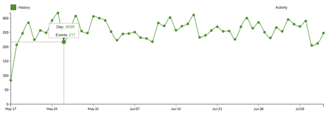
Figure 11. History dashboard showing the evolution in the activity (number of events) during two months in the past
Recommendations
Similar to the alerts dashboard, the recommendations panel lists the recommendations provided by the system, and the user can click on one of them to read further information about it.
Surveys
If the center has gathered information from satisfaction surveys, a summary of the results of these surveys is shown in this dashboard. It also shows the trend (whether positive or negative) using a color code so that users can easily identified whether patient perception has improved regarding a certain KPI.
Evaluation
The system has been evaluated at the residential center of Aravaca (Madrid, Spain), gathering a total of 7,473 events. The KPIs that have been identified as essential are the number of hourly events (avg.: 15.37), the average waiting time (351.15 secs), the average time required by the healthcare personnel (35.47 secs), the average time required by other processes (315.68 secs), the daily number of remote cancellations (avg.: 46.36), and the average number of available nurses (6.79).
During the pilot, we observed that the average waiting time during the night was much smaller (184.54 secs) than in other shifts, and most of the events took place in the evening shift (16.14 vs. 7.76 in the morning and 8.19 at night). Also, we conclude that there is a positive correlation between the number of events and the waiting time.
Regarding the floor number, we have seen that lower floors have more events and higher waiting times; further, the trend shows that as the floor number grows (from 1 to 4), the activity decreases.
The time frame between 8 p.m. and 1 a.m. is the busiest, showing that more personnel is required to attend the center's demand.
Additionally, we have considered satisfaction surveys as an additional validation mechanism. To ensure that the quality metrics match the surveys’ results, we have computed the Pearson R2 correlation between the satisfaction levels and the number of events and waiting times (see Table 1). As we expected, in almost every case, there is a strong inverse correlation, showing that more activity higher waiting times lead to less satisfied patients.
| |||||||||||||||||||||||||||||||||||||||||||||||
Conclusions and future work
In this paper we have presented DataCare, an intelligent and scalable healthcare management system. DataCare is able to retrieve data from AdvantCare through sensors which are installed in healthcare center rooms and from contextual information.
The Data Processing and Analysis modules are able to preprocess, process, and analyze data in a scalable fashion. The system processes are implemented over Apache Spark, and as such they are able to work with big data, and all data (including historic, real-time, and consolidated and aggregated values) are stored in MongoDB.
The Analytics Engine, which is part of the aforementioned module, implements a three-fold intelligent behavior. First, it provides a prediction system which is able to estimate the values of the KPIs for the rest of the day. This system runs as a daily batch process, and the forecast is updated twice, at 8 a.m. and at 4 p.m., to provide more accurate results. Second, it can provide both real-time alerts and early alerts, with the latter ones being fired when some future prediction of a KPI falls outside the expected boundaries. Third, a recommendation system is able to provide weekly recommendations to improve the overall center performance and metrics, thus impacting in a positive manner patient satisfaction. Recommendations are based on alerts and a pre-defined rules set consisting of 52 rules, which has been designed by experts.
For the users to be able to see and understand the valuable information provided by DataCare, the Visual Analytics module provides six different dashboards which displays a summary of the current status, real-time KPIs along with predictions and expected thresholds, historic values, alerts, recommendations, and patients’ surveys results.
DataCare has been implemented and tested in a real pilot in the residential center of Aravaca (Madrid, Spain). To validate the software, patients’ satisfaction and KPI correlation were explored, obtaining the expected results. The software also led to some interesting conclusions regarding how KPIs vary depending on the context, such as the shift or the floor.
After the pilot, we worked to identify some improvements, which are left for future work. First, healthcare personnel attending patients are not identified by the system, even though the sensors used allow this identification with the use of RFID tags. By identifying personnel, the center could trace the efficiency of each employee individually. Also, information about planned tours is very limited as it only observes the visited rooms and the visit times, but no other metrics.
So far, DataCare polls the AdvantCare API REST to retrieve data, but in the near future we will update the platform so that the communication is asynchronous.
To evaluate the prediction system, we also propose to develop a self-monitoring system which evaluates the deviation between the predicted and the real series, firing an alert if this deviation goes above a threshold, as it would mean that the prediction system is failing to accurately forecast the KPI.
Acknowledgements
Special acknowledgements to WildBit Studios for the development and pilots of DataCare. This project is partially funded by the Spanish Ministry of Industry, Energy and Tourism in the “Economy and Digital Society Strategic Action” program, under reference number TSI100105-2014-62.
References
- ↑ Curtwright, J.W.; Stolp-Smith, S.C.; Edell, E.S. (2000). "Strategic performance management: Development of a performance measurement system at the Mayo Clinic". Journal of Healthcare Management 45 (1): 58–68. PMID 11066953.
- ↑ Griffith, J.R. (2000). "Championship management for healthcare organizations". Journal of Healthcare Management 45 (1): 17–30. PMID 11066948.
- ↑ Ngai. E.W.T.; Poon, J.K.L.; Suk, F.F.C.; Ng, C.C. (2009). "Design of an RFID-based Healthcare Management System using an Information System Design Theory". Information Systems Frontiers 11 (4): 405–417. doi:10.1007/s10796-009-9154-3.
- ↑ Ting, S.L.; Kwok, S.K.; Tsang, A.H.; Lee, W.B. (2011). "Critical elements and lessons learnt from the implementation of an RFID-enabled healthcare management system in a medical organization". Journal of Medical Systems 35 (4): 657–69. doi:10.1007/s10916-009-9403-5.
- ↑ Jalal, A.; Kamal, S.; Kim, D. (2017). "A Depth Video-based Human Detection and Activity Recognition using Multi-features and Embedded Hidden Markov Models for Health Care Monitoring Systems".International Journal of Interactive Multimedia and Artificial Intelligence 4 (4): 54–62.doi:10.9781/ijimai.2017.447.
- ↑ Ghamdi, H.A.; Alshammari, R.; Razzak, M.I. (2016). "An ontology-based system to predict hospital readmission within 30 days". International Journal of Healthcare Management 9 (4): 236–244.doi:10.1080/20479700.2016.1139768.
- ↑ Bossen, C.; Danholt, P.; Ubbesen, M.B. et al. (2016). "Challenges of Data-driven Healthcare Management: New Skills and Work". 19th ACM Conference on Computer-Supported Cooperative Work and Social Computing: 5.
- ↑ Roberts, J.P.; Fisher, T.R.; Trowbridge, M.J.; Bent, C. (2016). "A design thinking framework for healthcare management and innovation". Healthcare 4 (1): 11–14. doi:10.1016/j.hjdsi.2015.12.002.PMID 27001093.
- ↑ Basole, R.C.; Bodner, D.A.; Rouse, W.B. (2013). "Healthcare management through organizational simulation". Decision Support Systems 55 (2): 552–563. doi:10.1016/j.dss.2012.10.012.
- ↑ Zeng, Q.L.; Li, D.D.; Yang, Y.B. (2013). "VIKOR method with enhanced accuracy for multiple criteria decision making in healthcare management". Journal of Medical Systems 37 (2): 9908.doi:10.1007/s10916-012-9908-1. PMID 23377778.
- ↑ Mohapatra, S. (2015). "Using integrated information system for patient benefits: A case study in India".International Journal of Healthcare Management 8 (4): 262–71. doi:10.1179/2047971915Y.0000000007.
- ↑ Fortenberry Jr., J.L. (2015). "Internal marketing: A pathway for healthcare facilities to improve the patient experience". International Journal of Healthcare Management 9 (1): 28–33.doi:10.1179/2047971915Y.0000000014.
- ↑ Minniti, M.J.; Blue, T.R.; Freed, D.; Ballen, S. (2016). "Patient-Interactive Healthcare Management, a Model for Achieving Patient Experience Excellence". Healthcare Information Management Systems. Springer. pp. 257–281. doi:10.1007/978-3-319-20765-0_16. ISBN 9783319207650.
- ↑ Baldominos, A.; Albacete, E.; Saez, Y.; Isasi, P. (2014). "A scalable machine learning online service for big data real-time analysis". 2014 IEEE Symposium on Computational Intelligence in Big Data.doi:10.1109/CIBD.2014.7011537.
- ↑ Zaharia, M.; Chowdhury, M.; Franklin, M.J. et al. (2010). "Spark: Cluster computing with working sets".Proceedings of the 2nd USENIX Conference on Hot Topics in Cloud Computing: 10.
- ↑ Zaharia, M.; Chowdhury, M.; Das, T. et al. (2012). "Resilient distributed datasets: A fault-tolerant abstraction for in-memory cluster computing". Proceedings of the 9th USENIX Conference on Networked Systems Design and Implementation: 2.
Notes
This presentation is faithful to the original, with only a few minor changes to presentation. Grammar has been updated for clarity. In some cases important information was missing from the references, and that information was added. The original article lists references alphabetically, but this version — by design — lists them in order of appearance.


